“A day without a challenge, is a day without a learning!”
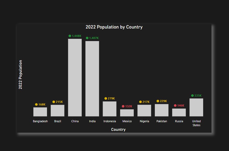
Today, I got a requirement from a client, where they asked for getting data labels along with icons along with conditional formatting, on top of the bars represented in a clustered column chart. Now this is something I had not done before, so started looking at various ways in Power BI until I achieved it.
Just to highlight here – conditional formatting is my favourite part of data visualisation in Power BI. I like to have challenges in this area as it keeps me to skill-up myself. There are many folks out there who have amazing blogs on conditional formatting tricks in Power BI, but there is a reason why I want to share my approach today related to this requirement. Trying to find a workaround in implementing this requirement, I actually came across a visual formatting setting which I never saw before in clustered column chart. May be it is there from some time, but I never paid attention to it. So, let’s start with the solution here.
Let’s represent a simple metric in a clustered column chart. Very simple chart showing 2022 population by countries.
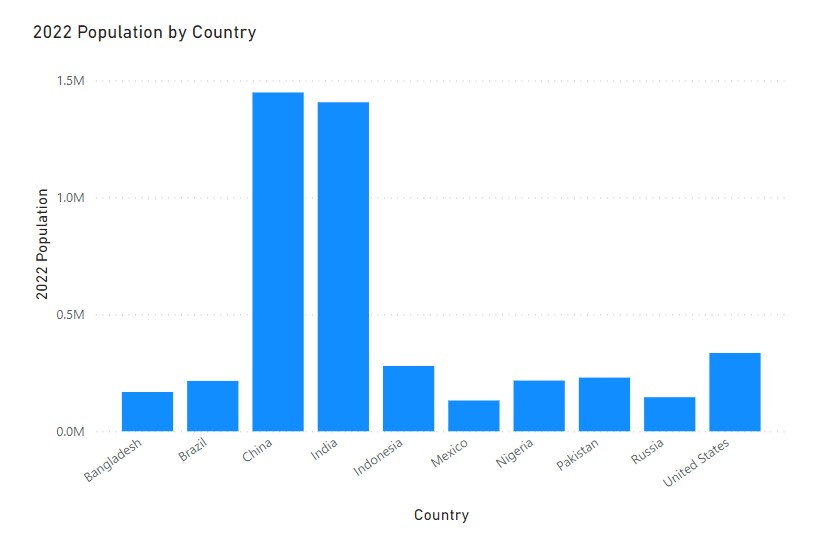
Now let’s get the data labels ON and y-axis off in the above chart. (as per best practices of data visualization, either have Y-axis or data labels, never Both)
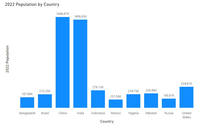
Now the ask here on this chart is we want to apply some conditional formatting in the bars based on the 2022 population value. This is easy, we can apply conditional formatting to bars easily.
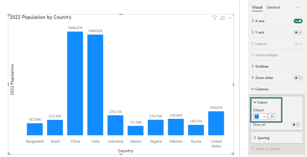
I am not going to go in the details of conditional formatting on bars here. But when you apply it using some rules, you will get something like this:
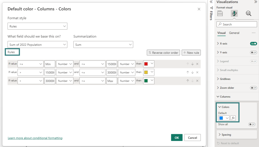
The above rules give following conditional formatting on the chart:
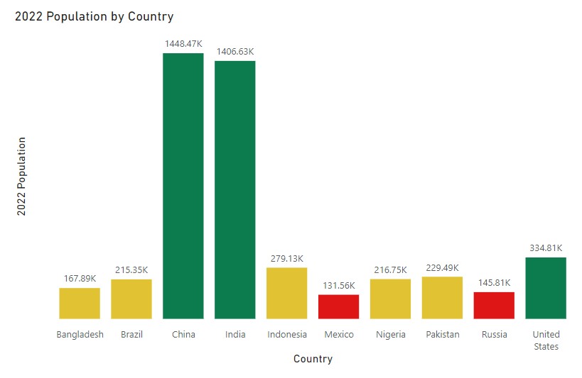
But this is not the required end result. The asked requirement is:
- All the bars on the chart should have same colours
- Like data labels at the top of bars, there should be an icon with these data labels
- Conditional formatting to be applied to [icon + data label] value
In order, to achieve this, I used a formatting setting in this visual called Custom Label. This setting can be found at:
Data Labels –> Values –> Custom Label
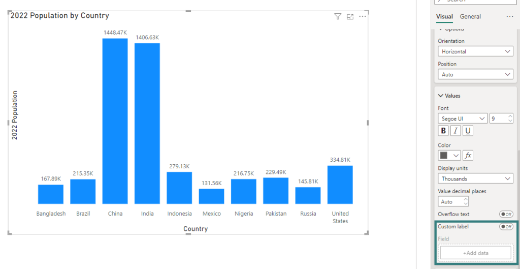
This setting allows me to create a custom data label for the bars on my chart. Currently I see default population values as data labels on this chart.
Once I turn-on custom label, I get the following window and has an option to select a column or a measure to be applied as a custom label to my bars on this visual:
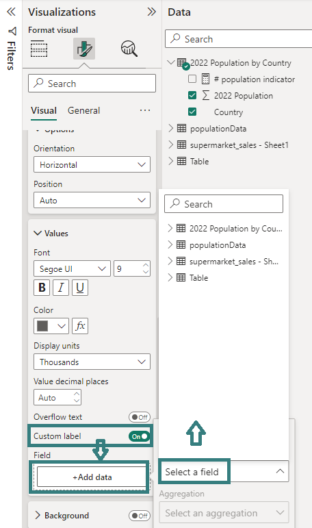
I created a measure which concatenates an icon with the population data measure. I created a measure to get the total population for 2022 and used it in the below label measure to concatenate with the icon (currently shown on bars) as follows:

The above measure takes the “⬤” icon and concatenates it with the population value in the data. We can test this measure in a simple table visual, and it gives us the overall data label as shown below:

Perfect! The data label looks good. Let’s move this custom data label using the custom label setting on the chart and see what it gives us. (I have removed the previous conditional formatting on the bars)
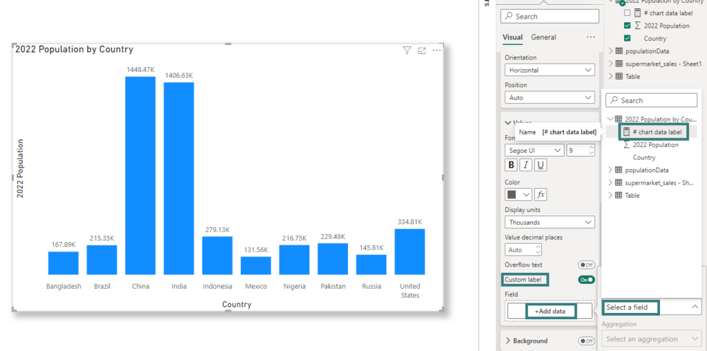
Once I select the chart data label measure, the data labels on the visual are shown as follow:
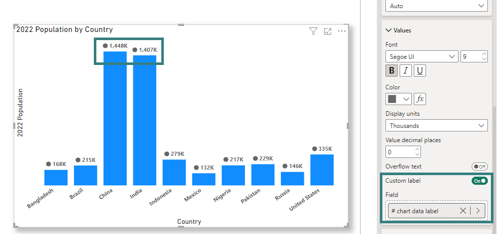
We can see the data labels on the top of the bars different to what we had previously. The data label now includes an icon. Ok we are nearly there as the conditional formatting is still remaining on these data labels. But again we can do that very easily.
In the clustered column chart, you have an option to apply conditional formatting to the data labels now.
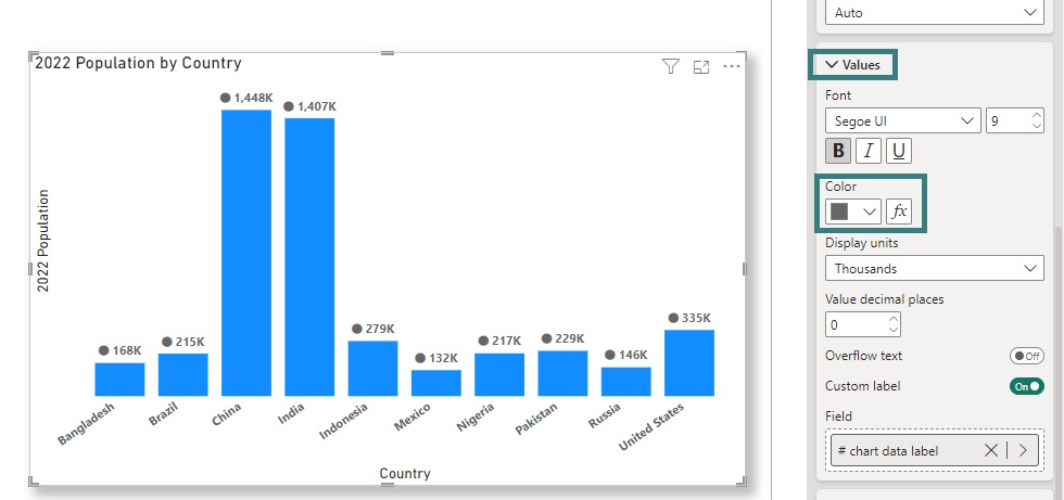
So, now we just go ahead, and write conditional formatting rules here.
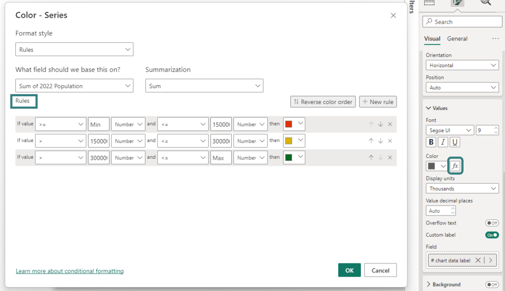
Once we apply these rules, bingo we get the conditional formatting on the custom data labels. 🙂
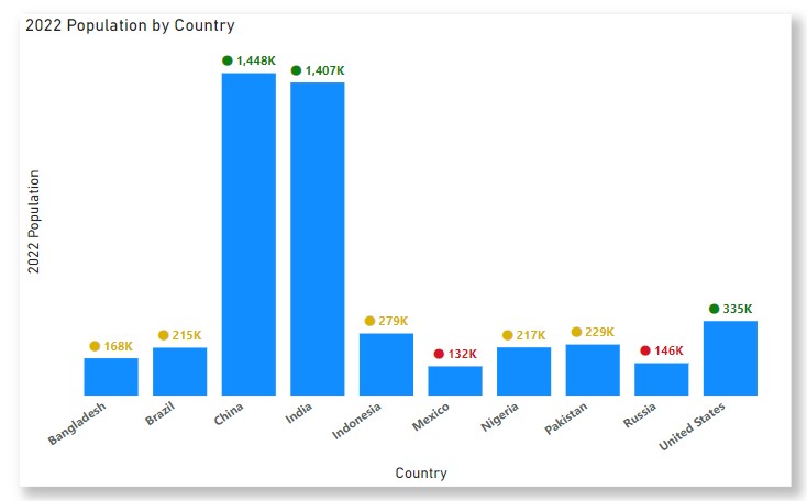
Sometimes the requirement by the client is not straight-forward, but there is always a workaround to achieving it.
Let me know your views on this trick. Have you used something like this before? If yes, don’t forget to share your approach!
Pragati


Amazing Solution !!!