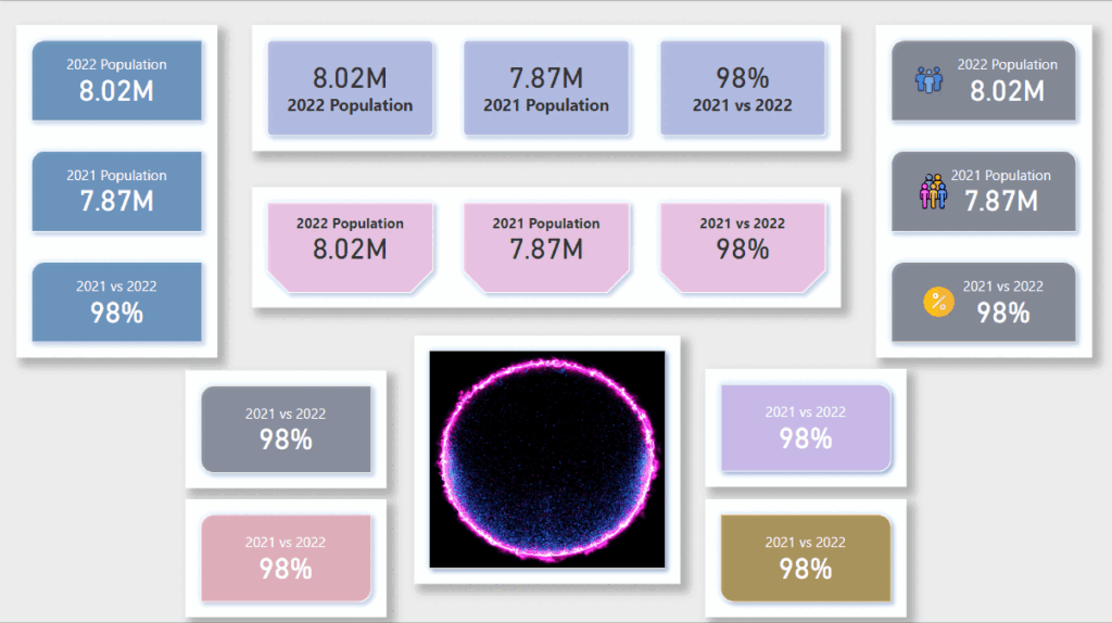
Current month Power BI update has got so many additions to it from having new card visual to Power BI Developer Mode; On-Object interaction updates to Admin Monitoring and so on. It just feels like a feast this month as we have got some capabilities that we as Power BI Developers have been waiting for some time.
In this blog I will be focussing on the new card visual that was released in this month’s Power BI update. Few things to know as a starter on this new visual is:
- It is released under Preview in Power BI
- It needs to be enabled in Power BI desktop settings as a Preview feature
I had a little play with this visual few days back and really think this is a great visual that we all have been waiting for some time. It is going to take away a lot of effort of clubbing multiple card visuals with text visuals together to show a KPI like visual on our Power BI reports. Let’s see what this visual has got for us.
Make sure you have the June 2023 version of Power BI Desktop
In order to use this new visual, you need to make sure your Power BI Desktop is upgraded to June 2023 version. If you are using a Microsoft Store version, then this should already been updated to June 2023 version (based on availability in your region). But if you using the standalone Power BI Desktop then you can download the latest update from here. Once you have updated Power BI Desktop, you can check what version it got updated to by navigating to File –> About and you see the version listed as shown below:
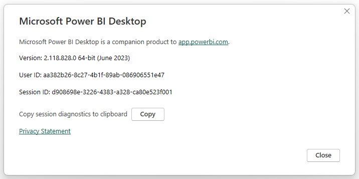
So now we have the latest Power BI Desktop version on our machine.
Enable the New Card Visual under Preview Features
You can enable the new card visual under File –> Options –> Preview features –> New card visual
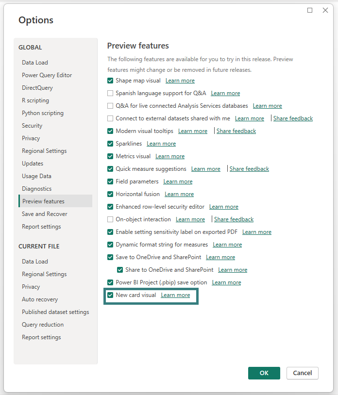
Once you enable this visual, you will see it under Visualisations section:
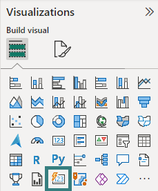
So, now we have finished all the prerequisite steps to get to the new card visual in the Power BI Desktop.
Create our First Visual using the New Card Visual
You can drag the new card visual on the report canvas and start adding your fields to it. It also supports multiple fields like a multi-card visual (existing visual in Power BI).
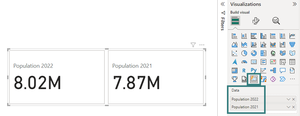
But the wow factor on this visual starts when we start exploring its formatting options. Let’s start with the Shape formatting.
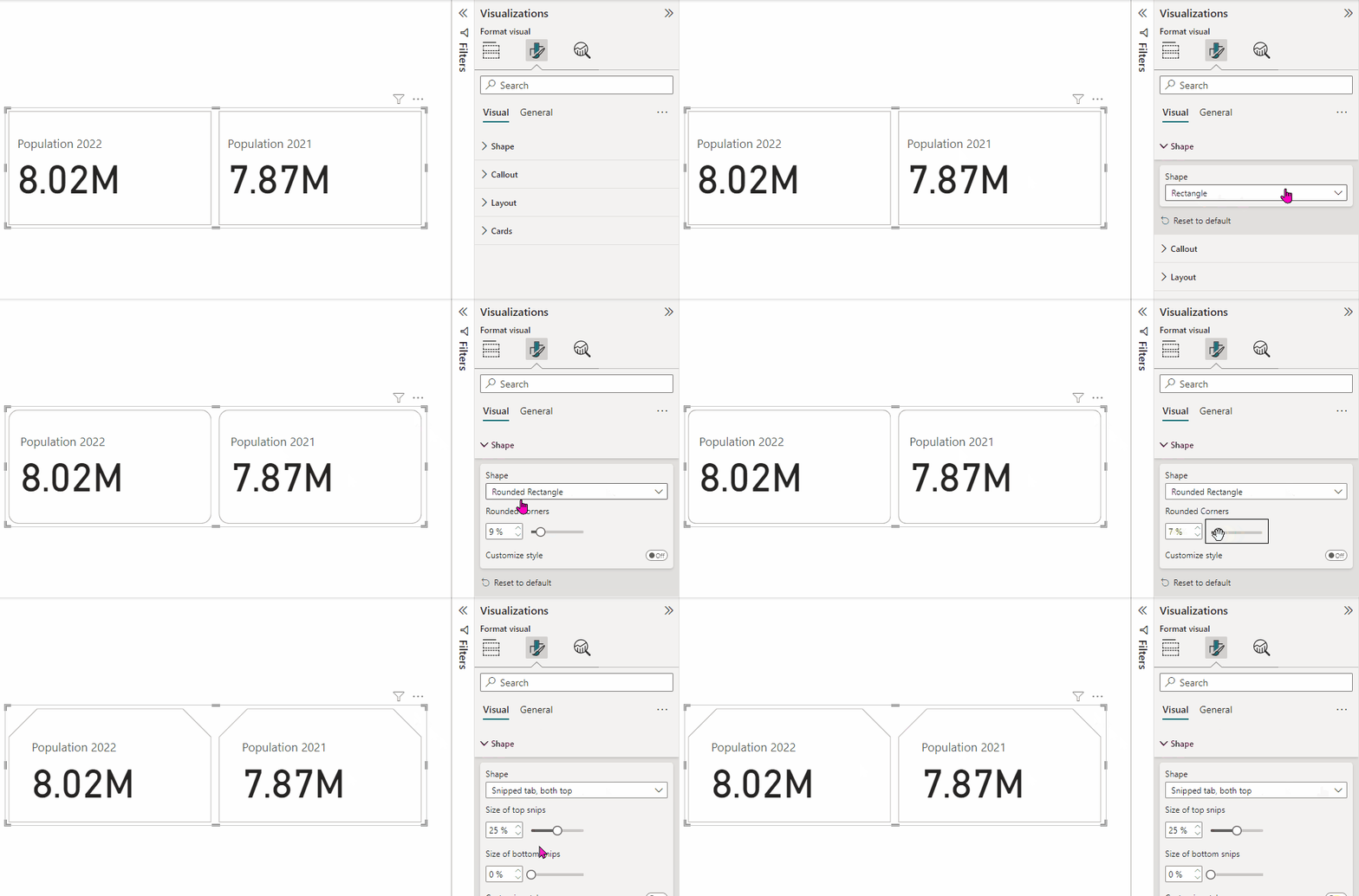
You can select different shapes for the card visual:
- Rectangle
- Rounded Rectangle
- Snipped tab, both top
On these shapes you can definitely customize with more options like Rounded Corners, Size of top snips, Size of bottom snips, etc.
The next formatting setting is Callout. There are so many option for formatting the values in the card, changing the alignment of the card value and label, even adding dynamic colours to card labels, etc.
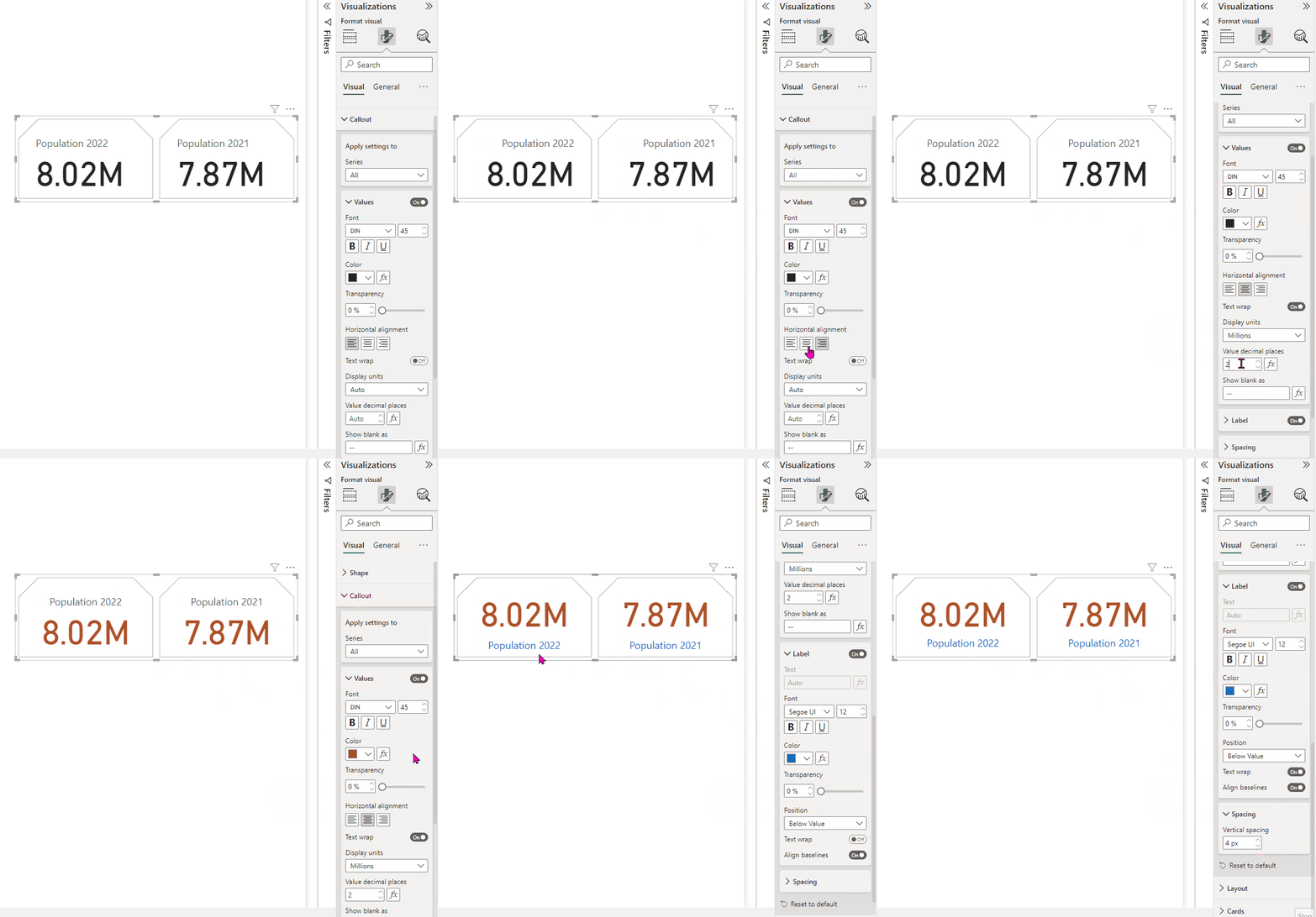
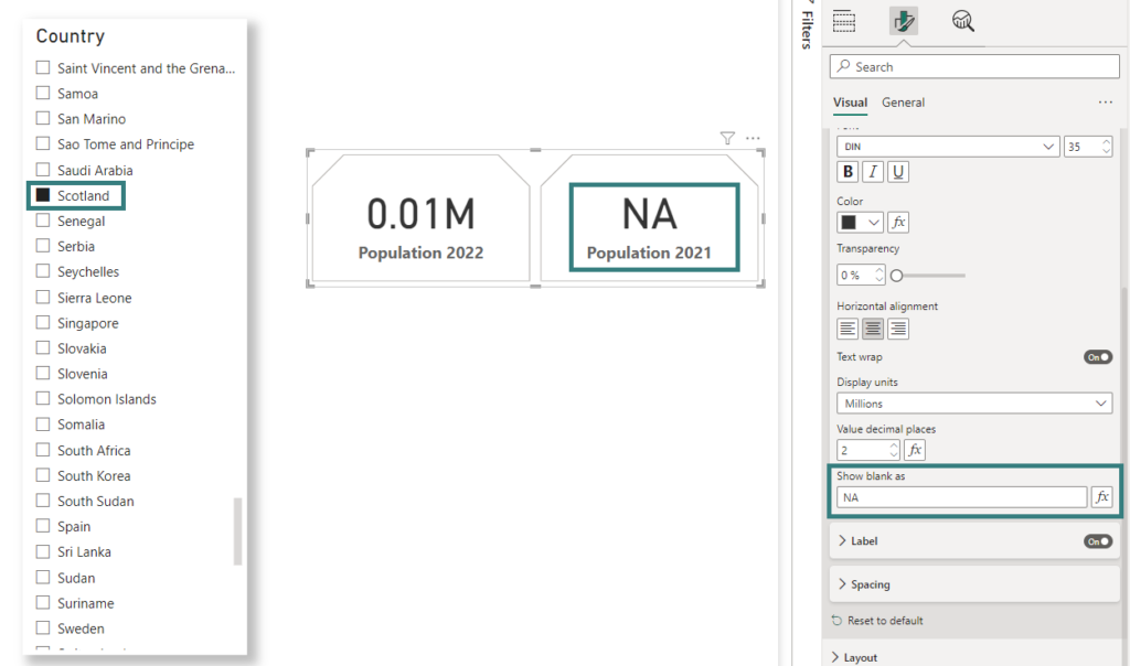
My favourite part on the Callout settings is Show blank as setting under Values section. Consider I have a COUNTRY slicer on this report page, where I am slicing the card information by country value. I send up seeing BLANK for one of the countries.
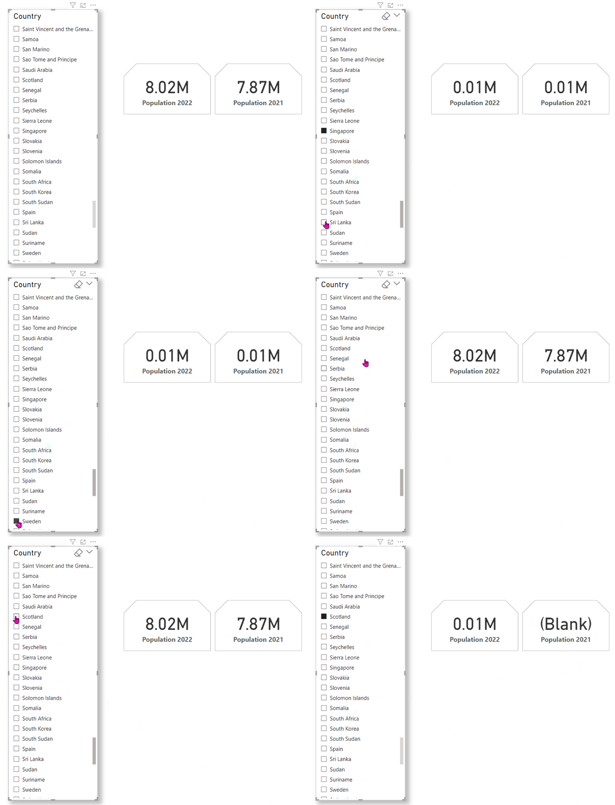
This Show as blank setting help us control this value on the card visual. Whatever value I define in this setting that is displayed in place of (BLANK) in the card visual, which is the general ask on the reports. Say, I add a value in this setting as NA then the card visual displays it whenever a value is not found for the selection. This value can be set as dynamic as well.
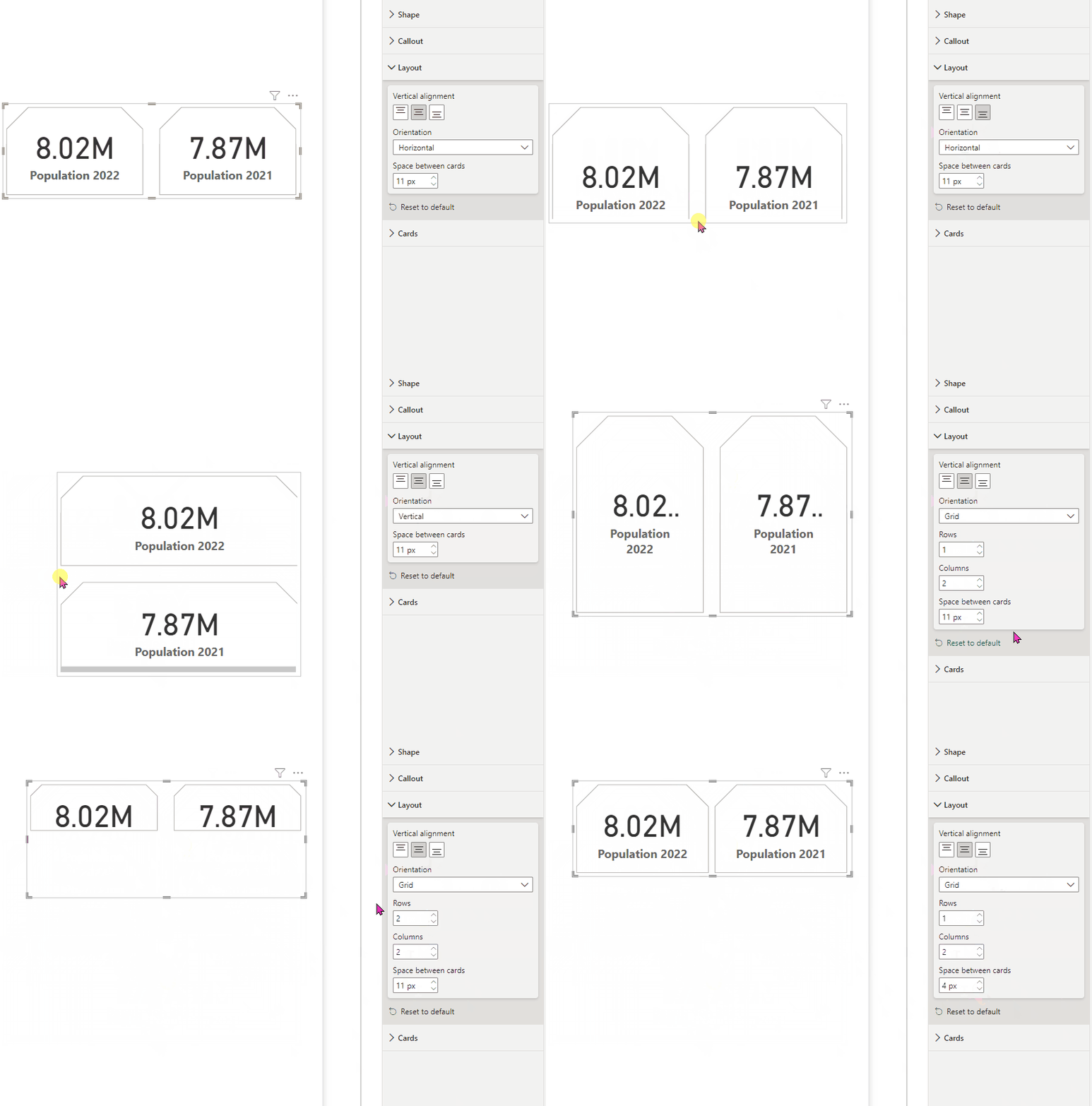
The next setting worth exploring is the card Layout. You can change alignment, orientation and spacing on card in this section.
The last but not the least, final formatting setting is Cards. There are lot many options you can apply here on the card visual. The setting can be applied to the whole card visual or to individual values within the card visual.
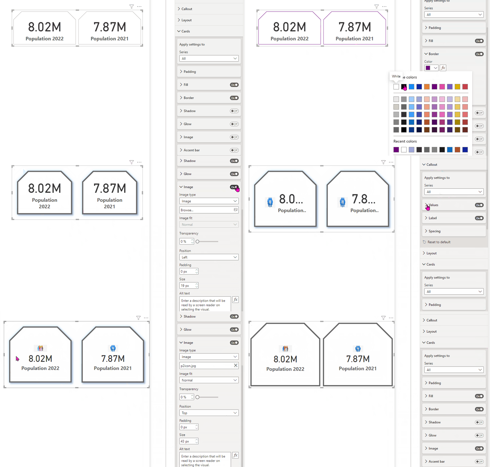
So many formatting settings to choose from and to many options as well.
Also did I tell you, you can bring in gif images as a background in this new card visual? Let’s see this quickly. Once I create a new card visual, I don’t see any formatting settings as, I haven’t moved any data field to it.
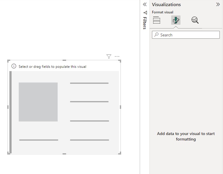
In order to see the settings, I will have to move a data field to my card visual and then I can set a background gif image under Cards –> Fill settings:
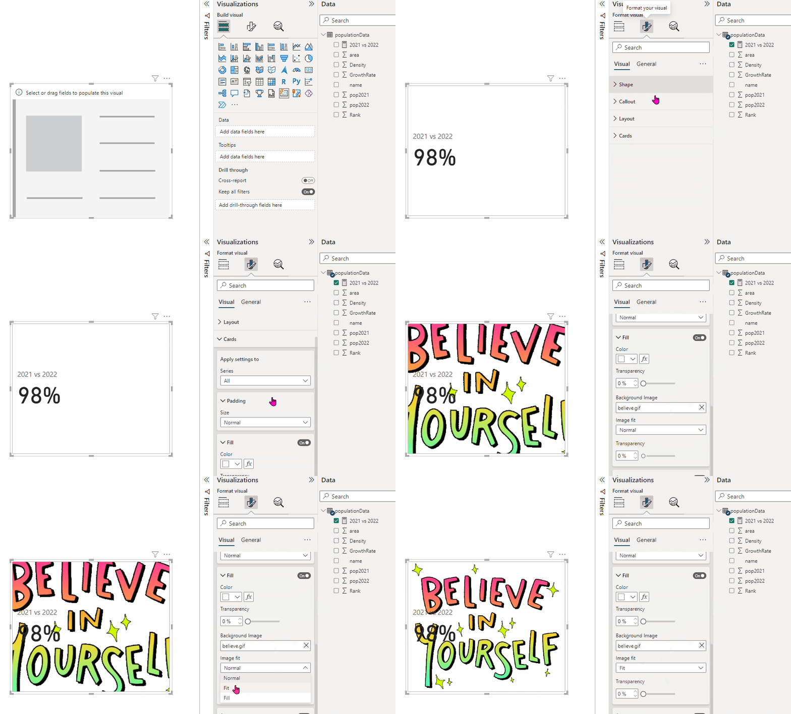
But what just happened here? Along with my background image, I see the value moved in the card visual. But I just want my say gif image. So let’s just do a very simple setting to the callout value and the card label.
What I just did here:
- Callout value setting: I set the transparency = 100% for the value
- Label setting: I disabled this setting
This removed the callout value and the card label from the card and I ended up with just my background gif image.
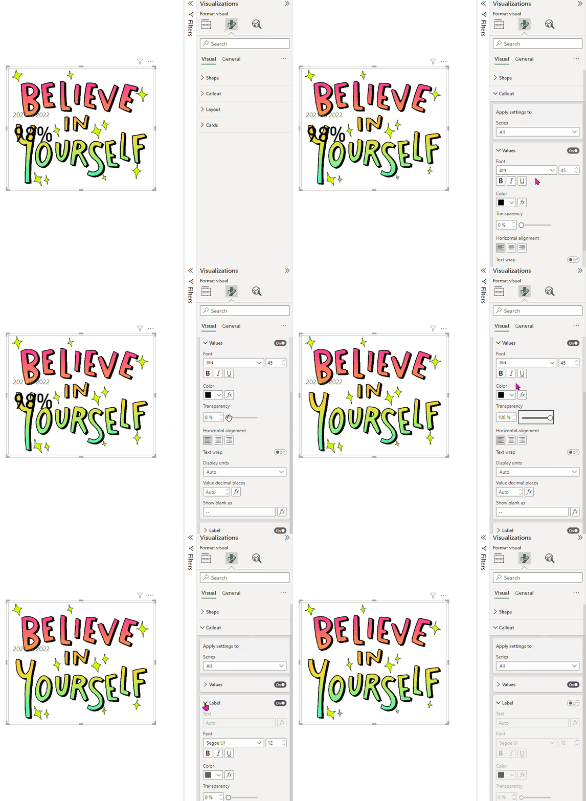
There are many other formatting options you can use to modify your new card visual and make them more interactive on your reports.
Let me know your views on how this new card visual is treating you. Have you already started using it? Are you planning to use it soon on your reports to enrich them? I look forward to your thoughts here.
Pragati

